
Module 8: Working with Raster Data
Learning Objectives
Create raster data
Change raster symbology
Perform terrain analysis
Thus far we’ve worked mostly with vector data, which consists of features, and these features are themselves made up of points and lines. In this module we will learn about raster data. Remember when you were editing OpenStreetMap in JOSM? The points, lines and shapes that you drew were vector data. But when you loaded Bing aerial imagery in the background, that was raster data. So what’s the difference?
Raster data essentially comes in the form of an image. It is made up of pixels, like a photograph, and a raster image will always be some number of pixels wide and some number of pixels high. If you zoom in far enough on a raster image, it will start to become blurry, just as if you opened a photo on your computer and zoomed in very close. As we’ll see in this module, however, a raster image can mean more than just a photograph from the sky. Follow along and we’ll learn all about rasters!
1. Loading raster data
Open the project named
sleman_2_7.qgsin the directoryqgis/. We’ve simplified the project since the last module to make it easier to follow along, and so that our layers load a bit faster. However, if you are comfortable you can easily carry on with your project from the previous module.Click on the Load Raster Layer button:

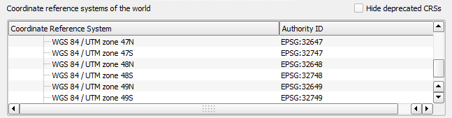
The Load Raster Layer dialog will open. Find the file in the directory
Sleman/namedSleman.tif. Open it.QGIS will open a dialog which explains that the new layer does not have a CRS assigned. In the box at the bottom, scroll down until you find WGS 84 / UTM zone 49S. Select it and click OK.
When the raster layer loads, be sure to drag it to the bottom of the list in the Layers panel.
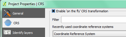
If you can’t see the raster layer, you may need to enable ‘on the fly’ transformations. To do so:
Go to
Check the box next to Enable ‘on the fly’ CRS transformation.
Click OK.
The raster should display nicely underneath your vector data layers.
2. Changing raster symbology
Not all raster data consists of aerial photographs. There are many other forms of raster data, and in many of those cases, it’s essential to symbolise the data so that it becomes properly visible and useful. In this section we’ll add a new kind of raster and see how to change it’s symbology.
First let’s remove our previous raster image so that our project will load faster. Right-click on the Sleman layer and click Remove.
Click on the Load Raster Layer button:
Open the file named
SRTM_Sleman.tif, which is located inSleman/SRTM/.When it appears in the Layers panel, right-click on it and click Rename. Give it the name DEM.
Note
This dataset is a Digital Elevation Model (DEM). It’s a map of the elevation (altitude) of the terrain, showing us where the mountains and valleys are. In an aerial photograph, each pixel in the image is a colour. When we view all of these different coloured pixels together, they show us something we can understand - the Earth as viewed from above. In a DEM, each pixel has a different value instead of colour. The value of each pixel represents elevation.
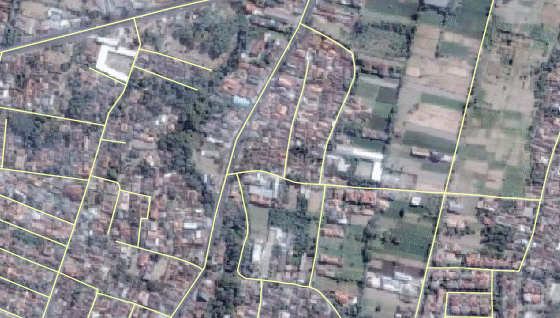
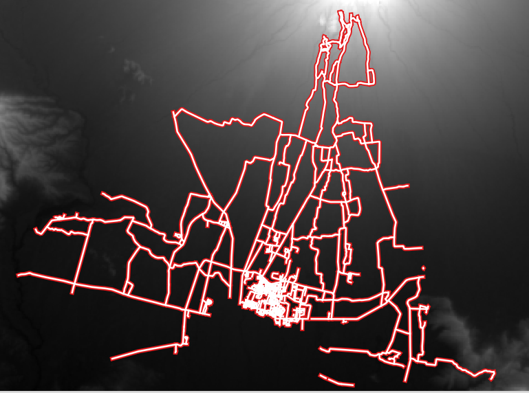
When it loads, you’ll notice that the new raster image appears as a grey rectangle. It’s seen here with the roads layers on top:
The layer appears grey (and doesn’t give us any information) because its symbology hasn’t been customised yet. In the colour aerial photograph we loaded previously, everything is already defined. But if you load a raster image and it’s just a grey rectangle, then you know there’s no symbology for it yet. It still needs to be defined. That’s what we will do next.
Open the Layer Properties dialog for the SRTM layer, which is now named DEM.
Switch to the Style tab. This shows the current symbology settings, and as we’ve seen, they don’t give us much information on the layer. Let’s make sure the layer has data in it.
Change the Render type to Singleband pseudocolor.
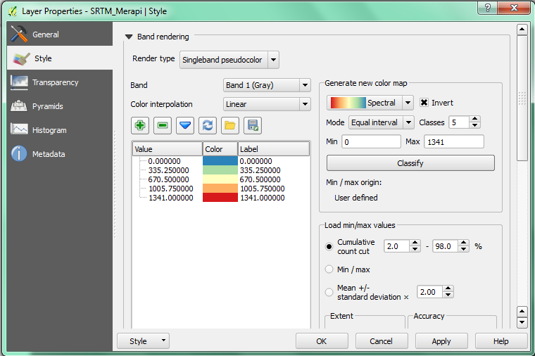
Click OK. The raster should look like this:
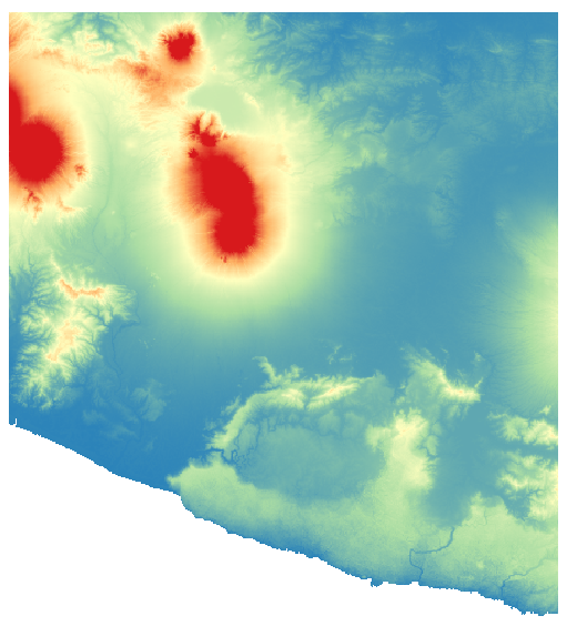
Good! This tells us that there is data in this layer. And by looking at it we can get an idea of where the elevation gets higher. In the north we can see the location of Mount Merapi.
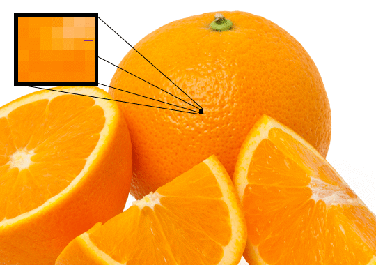
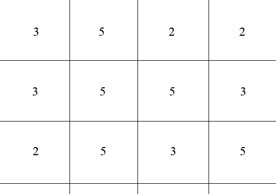
Let’s stop for a minute and understand what is happening here. Remember that an image is made up of pixels, individual cells that contain a value, which is usually a colour value. For example, if you zoom in very closely on a photograph you can see those individual pixels, like this:
The value of each cell is saved in the file. Imagine the file being saved something like this, where each square is a pixel:
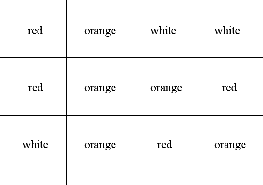
Of course the computer doesn’t understand words for colours. In fact the value of each cell would be a number, which the computer then associates with a certain colour. For our aerial image, this is already defined. Since it is a normal image, it knows to associate the numbers for each pixel in the file with the common colours that we see every day. But this new raster image is different, because the values of each pixel don’t represent colours, but rather altitude, and QGIS doesn’t know automatically how to display it. Hence it shows every pixel in the image as grey, even if the values in each pixel are different. When we change the symbology to Psuedocolor, we can see all the different pixel values shown with various colours.
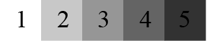
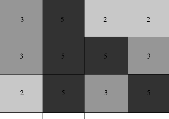
It would be nice to represent our DEM layer as a greyscale spectrum, rather than a variety of bright colours.. Next we will tell QGIS to symbolise the layer with colours in a spectrum, beginning at the lowest pixel value in the file and ending at the highest pixel value. In other words, if the pixel values looked like this:
QGIS would create a spectrum equating numbers to colours like this:
And render the image like this:
Open the Layer Properties again.
Switch the render type back to Singleband gray (1).
Check the box next to Min / max (2).
Next to Contrast enhancement, select Stretch to MinMax (3).
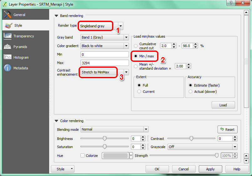
But what are the minimum and maximum values that should be used? The current values are those that just gave us a grey rectangle. Instead, we should be using the minimum and maximum pixel values that are actually in the image. You can determine those values easily by loading the minimum and maximum values of the raster.
Under Load min / max values, select Estimate (faster).
Click the Load button:
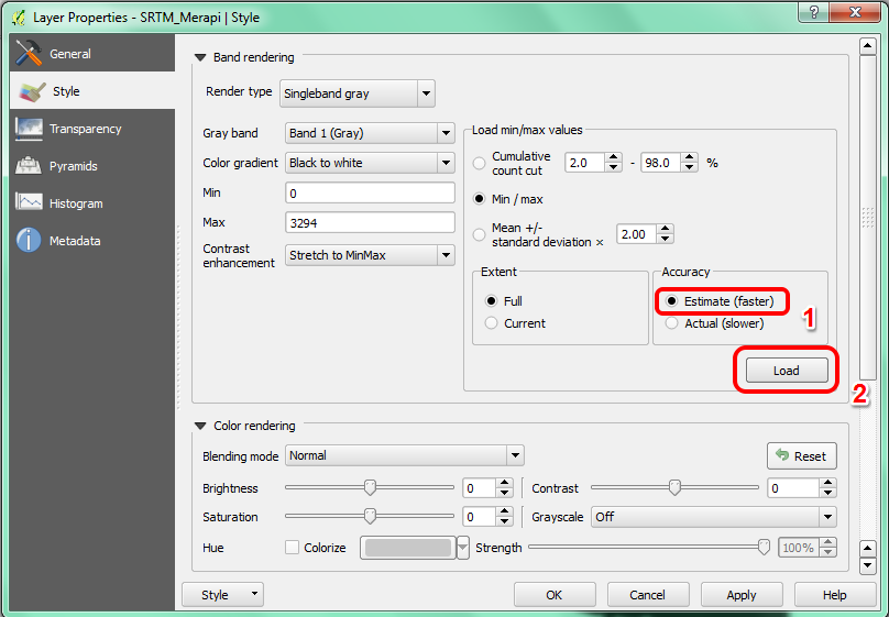
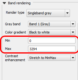
Notice how the custom Min and Max values have changed. The lowest pixel value in this image file is 0 and the highest is about 3294.
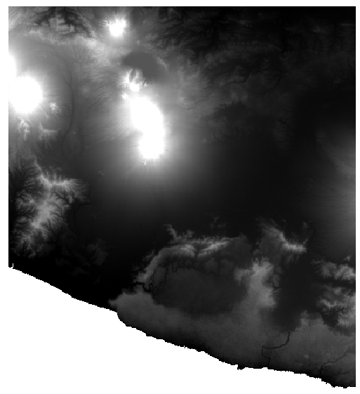
Click OK. You should see the values of the raster properly displayed, with the darker colours representing valleys and the lighter ones, mountains:
We’ve learned to do this the tricky way, but can we do it faster? Of course! Now that you understand what needs to be done, you’ll be glad to know that there’s a tool for doing all of this more easily.
Remove DEM from the Layers panel, by right-clicking it and clicking .
Load the raster image again, renaming it to DEM as before. It will be a grey rectangle again.
Enable the tool you’ll need by enabling . These icons will appear in the interface:
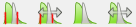
The button on the right will stretch the minimum and maximum values to give you the best contrast in the local area that you’re zoomed into. It’s useful for large datasets. The button on the left will stretch the minimum and maximum values to constant values across the whole image.
Click the left button labelled (Stretch Histogram to Full Dataset). You’ll see the data is now correctly represented as before! Easy!
3. Terrain analysis
Certain types of rasters allow you to gain more insight into the terrain that they represent. Digital Elevation Models (DEMs) are particularly useful in this regard. In this section we’ll do a little bit more with our DEM raster, in order to try to extract more information from it.
3.1 Calculating a hillshade
The DEM you have on your map right now does show you the elevation of the terrain, but it can sometimes seem a little abstract. It contains all the 3D elevation information about the terrain that you need, but it doesn’t really look 3-Dimensional. To get a better look at the terrain, it is possible to calculate a hillshade, which is a raster that maps the terrain using light and shadow to create a 3D-looking image.
To work with DEMs, we will use the all-in-one DEM (Terrain models) analysis tool.
Go to .
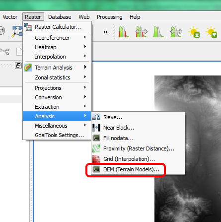
In the dialog that appears, ensure that the input file is the DEM layer.
Set the output file to hillshade.tif in the directory
qgis/Sleman/.
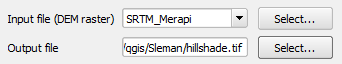
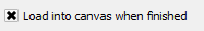
Check the box next to Load into canvas when finished.
Leave all the other options unchanged.
Click OK to generate the hillshade.
When the processing is complete, click OK on the notification.
Click Close in the dialog.
There should now be a new layer called hillshade that looks like this:
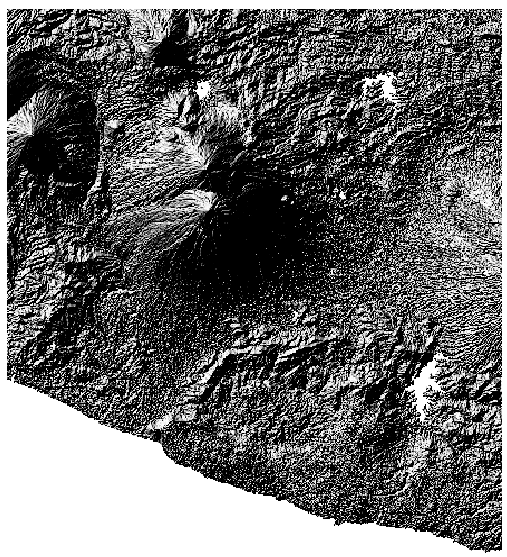
This looks more Three-Dimensional, but can we improve on this? On its own, the hillshade looks like a plaster cast. It will look better if we can combine it with our more colourful DEM. We can do this by making the hillshade layer an overlay.
3.2 Using a hillshade as an overlay
A hillshade can provide very useful information about the sunlight at a given time of day. But it can also be used for aesthetic purposes, to make the map look better. The key to this is setting the hillshade to being mostly transparent.
Change the symbology of the original DEM layer to use the Pseudocolor scheme.
Hide all the layers except the DEM and hillshade layers.
Click and drag the DEM layer beneath the hillshade layer in the Layers panel.
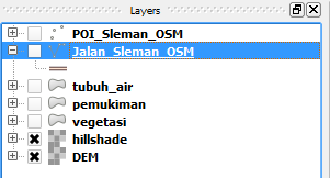
Ensure that Control rendering order is checked.
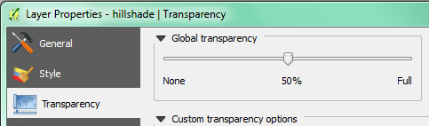
Now we will make the hillshade layer somewhat transparent. Open its Layer Properties and go to the Transparency tab.
Set the Global transparency to 50%:
Click OK in the Layer Properties dialog. You should get a result similar to this:
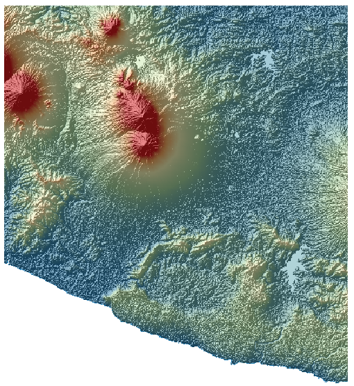
Switch the hillshade layer off and on in the Layers panel to see the difference it makes.
Using a hillshade in this way, it’s possible to enhance the topography of the landscape. If the effect doesn’t seem strong enough to you, you can change the transparency of the hillshade layer; but of course, the brighter the hillshade becomes, the dimmer the colours behind it will be. You will need to find a balance that works for you.